Color notes
I have been watching a bunch of Marco Bucci painting lesson videos, particularly his 10 Minutes to Better Painting series. The episode about color notes was particularly inspiring, and then the exercise proposed in this video gave me the impetus to try it out. Additional stylistic input from the apple tutorial contributes to a very different kind of painting than most of what you’ve seen from me.
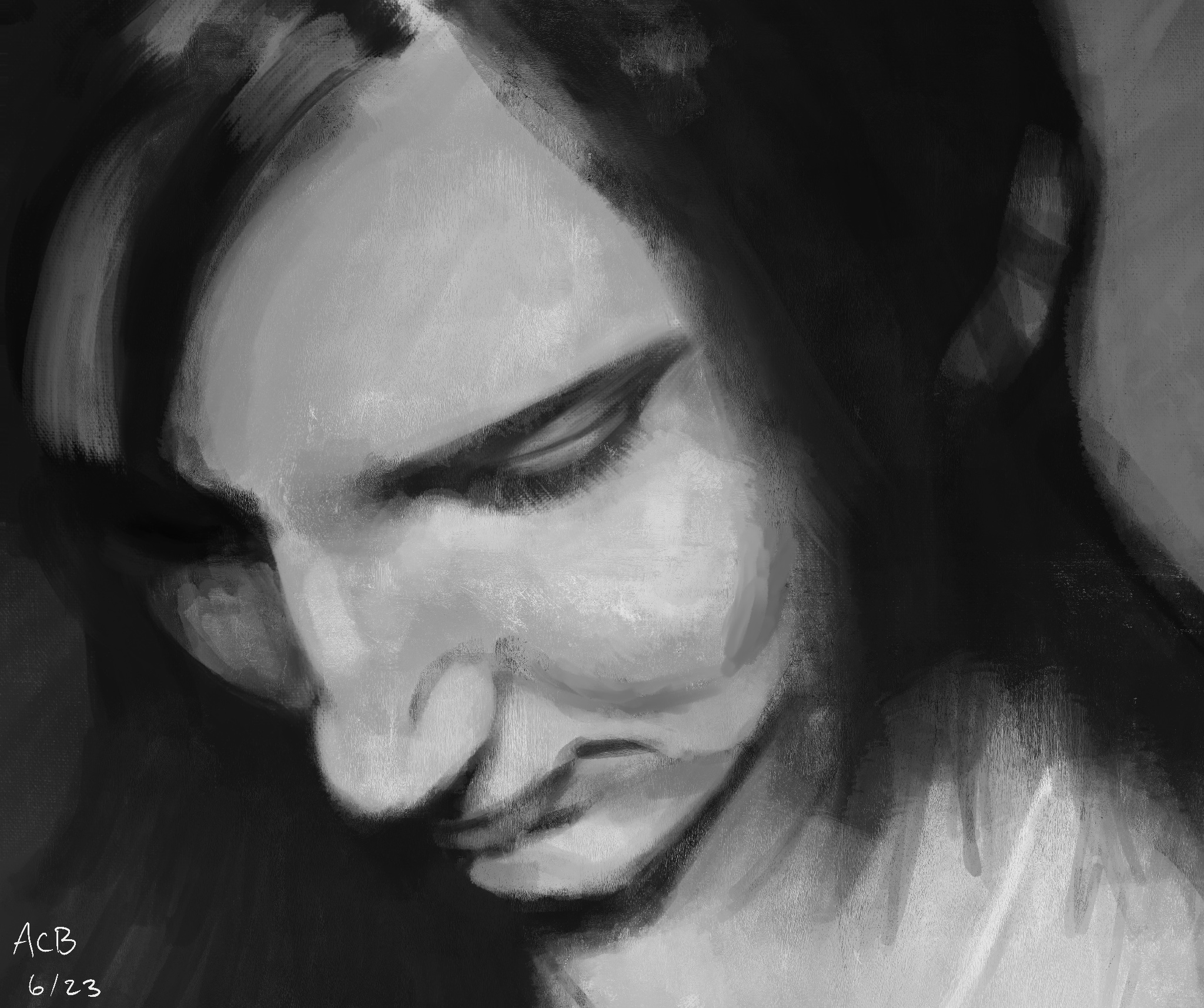
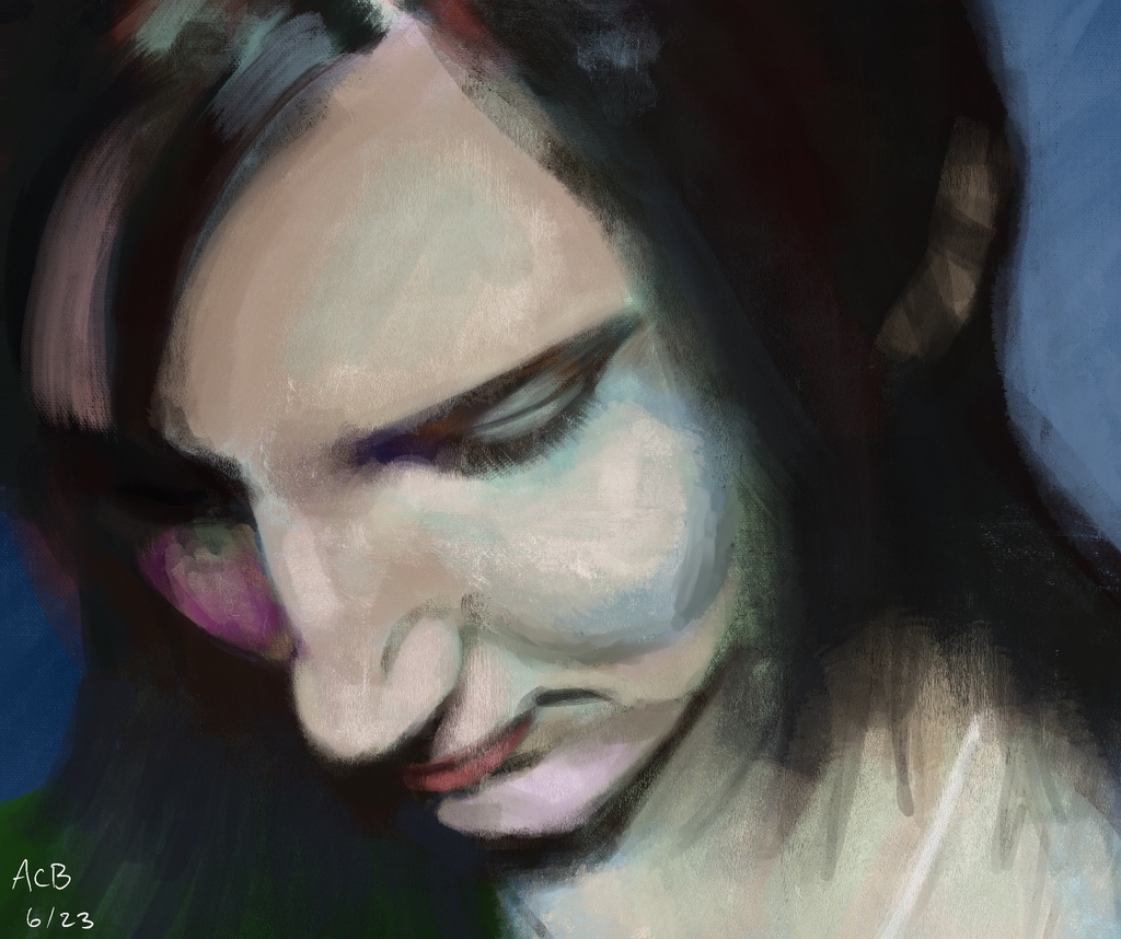
This is a painting of Aftyn Rose made with random colors and broad brushes. It is still digital, but using a much more “opinionated” brush than I usually employ, which gives the thing a textured, on-canvas feel. The randomized color trick uses a digital filter layer (Color mode, pure white fill) that removes all visible color information, so this looked like just a value study as it progressed. Each time I went to do a new value, I would also switch up the hue and saturation. The choices weren’t entirely random — I was still picking them, but I couldn’t see what they were getting applied on top of. I also chose not to fight the broad, blotchy nature of the brush I was using. Parts of this are messy in a way I don’t usually allow, but I admire the effect.

I also did no sketch ahead of time. This painting was made entirely by scrubbing in basic shapes with broad strokes, and then pushing those around with corrective strokes until it started looking more like the reference. It’s not quite the basic shapes strategy Bucci recommends, but a much closer approximation than my usual.
At the end, when I hid the filter layer and saw what I had wrought, I was pleasantly surprised. It’s hasty and lacks any real color theming, but as a shake-up of my creative process, I think it was a complete success.
