The sun shines through her smile
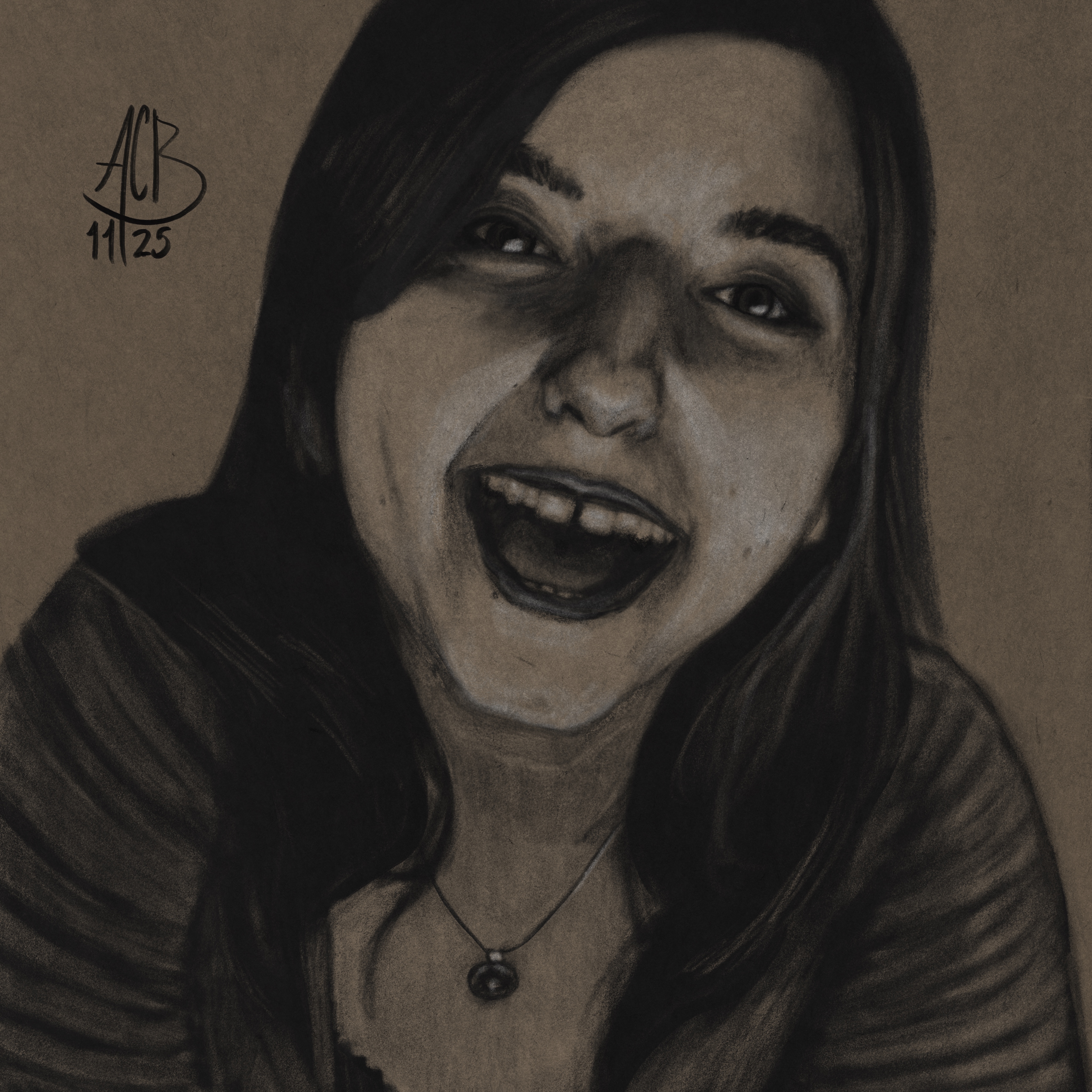
This is a charcoal rendering of Aftyn Rose, with a focus on making clear separations between the shapes of value. I have long admired those toned paper portraits that build off a mid-tone page with lights and darks to describe the subject. You may have seen me trying it out, with marginal success, on the recent Vampire piece. I think this one is a better rendition of that style.
When I started out, I didn’t have a clear plan about value categories, something I still struggle with. What is the midtone in this piece? My first revision used too much shade, and areas of highlight were too close to the shade, which led to a high contrast mess.
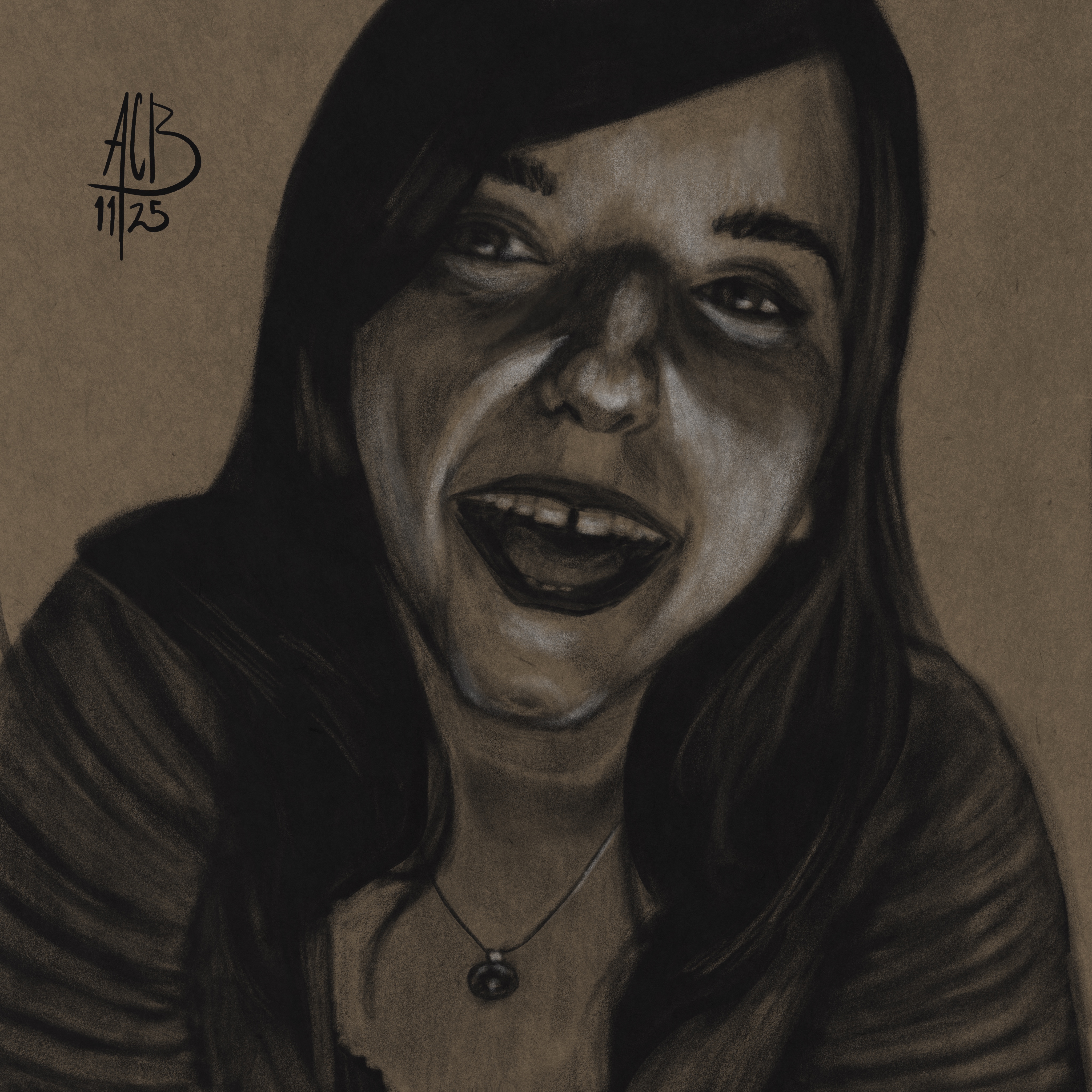
I spent the whole second day just erasing stuff and trying to get the values to settle. Even now, if you zoom out enough, the picture doesn’t really “read”, so I’ve still messed something up. But I think it looks pretty good now.
The reference is from her wonderful Ear massage and eye contact video. I visited that video once before, in my early days. Unlike some of those early pieces, I think that old one still stands up. For this piece, I went looking through my references for one with some nice, sharp shadows and highlights.
I’ve slowed down posting lately. A lot of that is making plans to move soon, including buying and selling houses. Because this website is hosted on a box in my closet, there will be a stretch during the move when it won’t be available. Hopefully the down time won’t last more than a week.
I’ve also had a bunch of training pages that aren’t worth sharing and experimental poses that haven’t come together. I will admit: my confidence is at a low. This drawing was me experimenting with the new release of Procreate that brought along a bunch of upgraded brushes. I’ve gotten rusty with that tool, but I did appreciate the new brush engine. They were easier to control and more intuitive, across the board.
Medium: Digital
App: Procreate
Tools: Charcoal