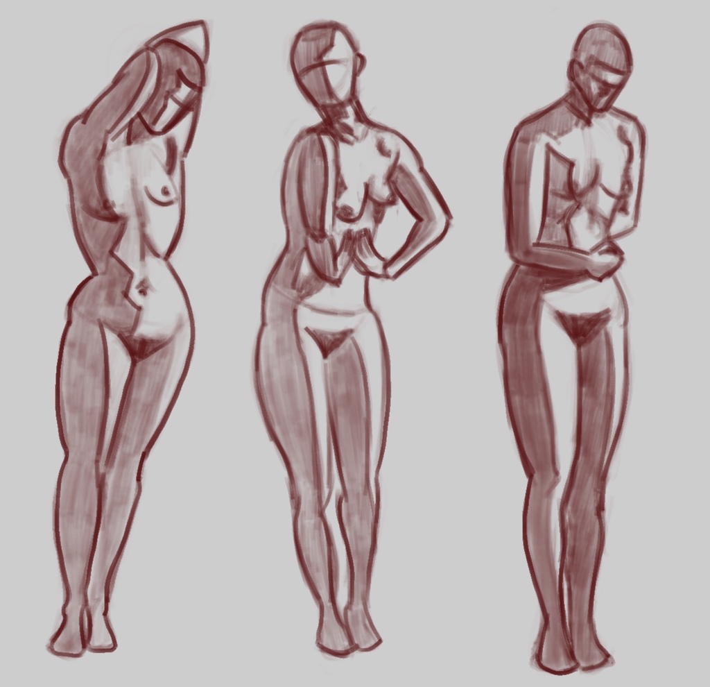
Study group - edges 3
The Love Life Drawing study group exercise of the week addresses using different kinds of lines to communicate different edges in a figure. Honestly, I didn’t exactly nail this task. I think my figures look pretty good — all that drilling on figure drawing fundamentals has been paying off. But in terms of the line weights and density, this isn’t the end goal.
I have been experimenting with the Procreate pressure curve formula, looking to strike a balance for my level of hand control. Can I get soft or bold lines when I intend to? Can I make a shade patch look uniform? I think I’m getting close to the right formula for myself. This set marks progress on that front.
But what I don’t have here is a clear distinction between the figure’s outline and areas of form shadow. A form shadow is one where the surface curves away from the source of light. Typically, you do get a bit of an edge along the border of the shaded area, nearest the light, called a terminator line. I think in reality the whole shaded area would be the same dark value as the terminator, but usually you’ll get a bit of bounce light brightening up parts on the rest of it.
Getting that terminator line right is a delicate balance. You want to suggest the form is curved, and a sharp line doesn’t say that. Look at the legs in my figures. The lit areas look good, and the shaded patch is fine, but the edge between them has very similar line weight to the figure’s outline. I think I need to make those edges wider, side of the pen, but so far my level of control with holding the pen that way is low. More practice needed!
